Perfect Properties: Overview
Searching for the right property can be a long, complicated process, whether it's the perfect home or a first-time real estate investment.
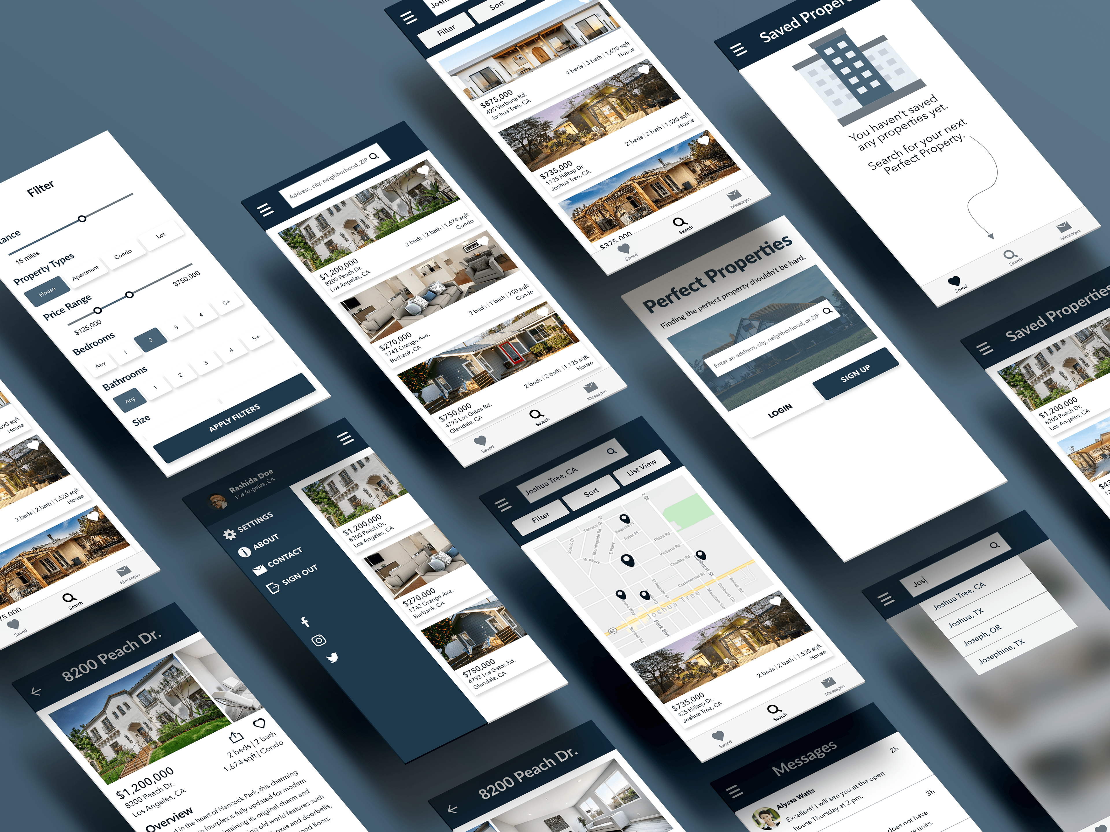
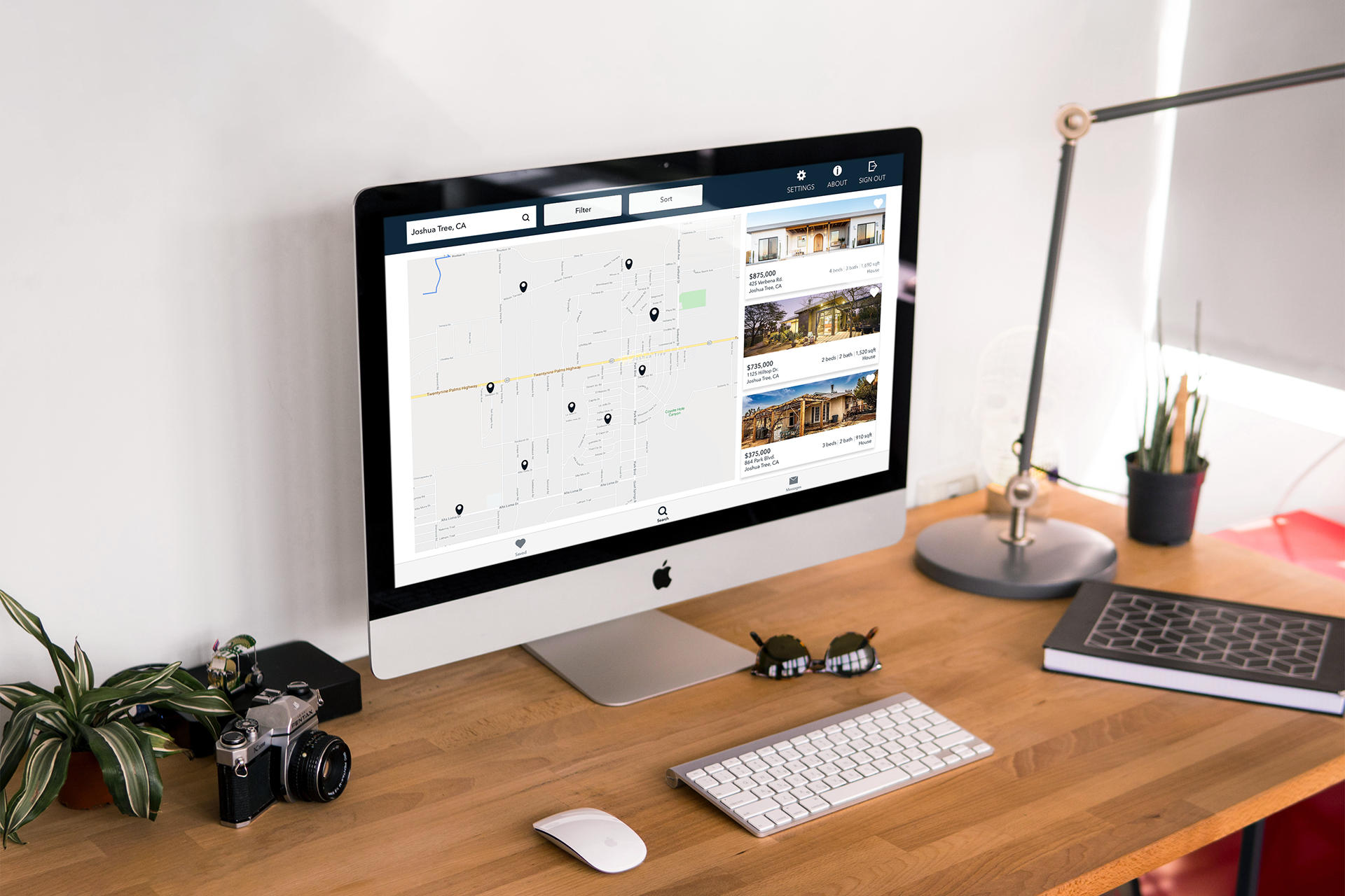
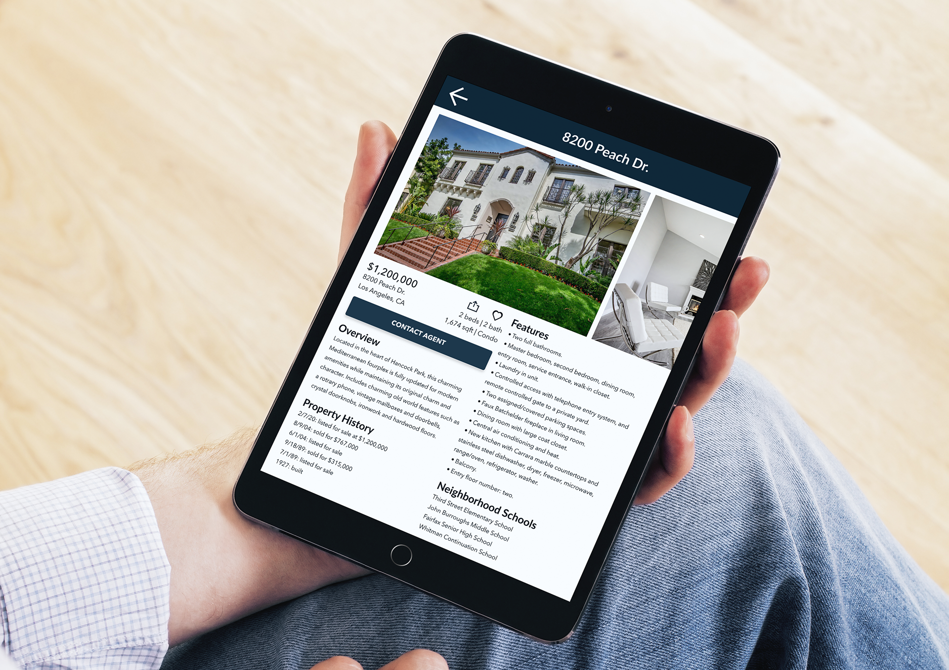
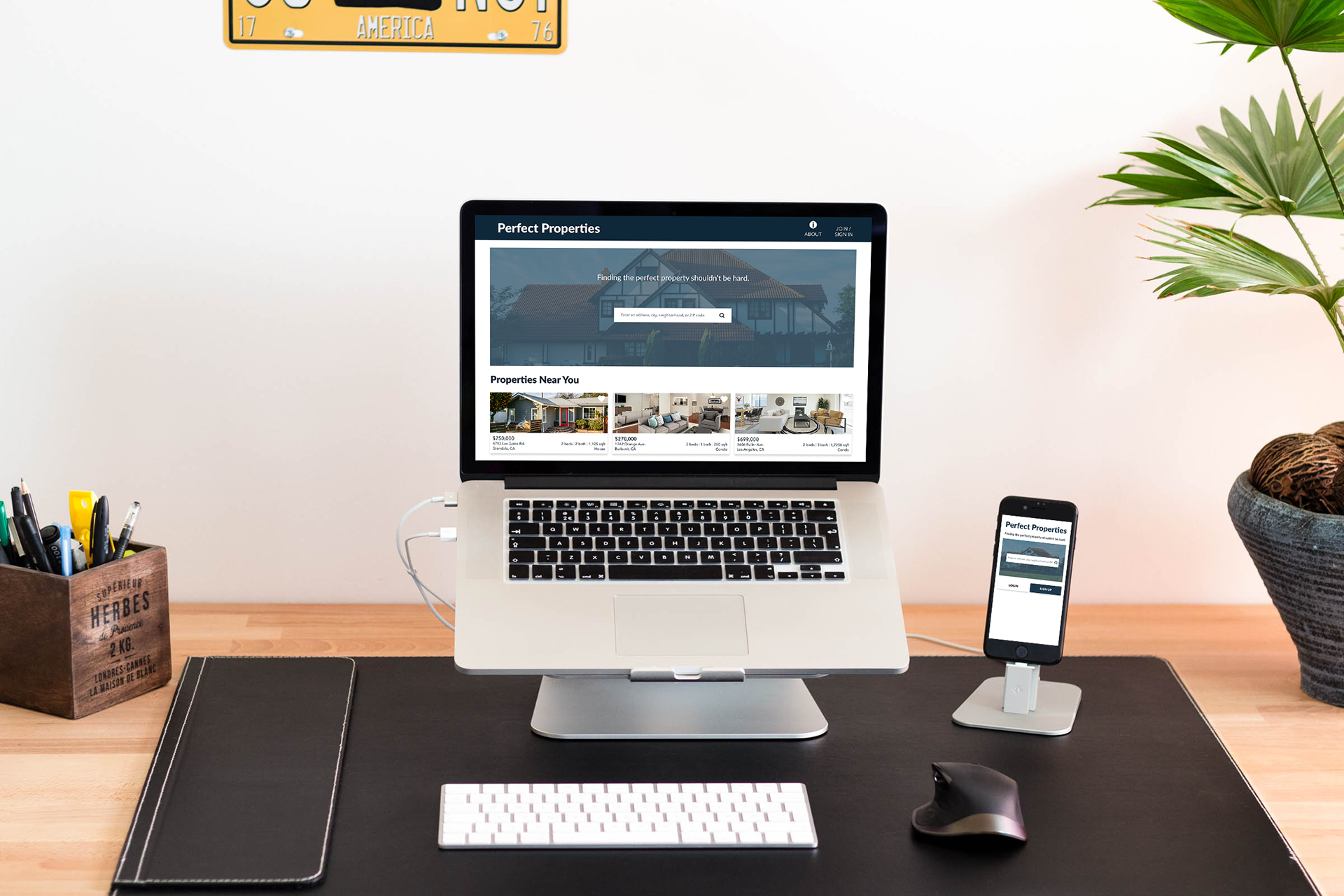
Perfect Properties is a responsive web app that provides investment property buyers with a way to search listings and gather information with ease.
Objective: A responsive web app that provides property buyers with information on properties of interest.
Role: Lead UI Designer (85% UI, 15% UX)
Timeline: October 2019 - February 2020
Tools: Adobe XD, Balsamiq, InVision, Sketch, Adobe Photoshop, Keynote, pen and paper
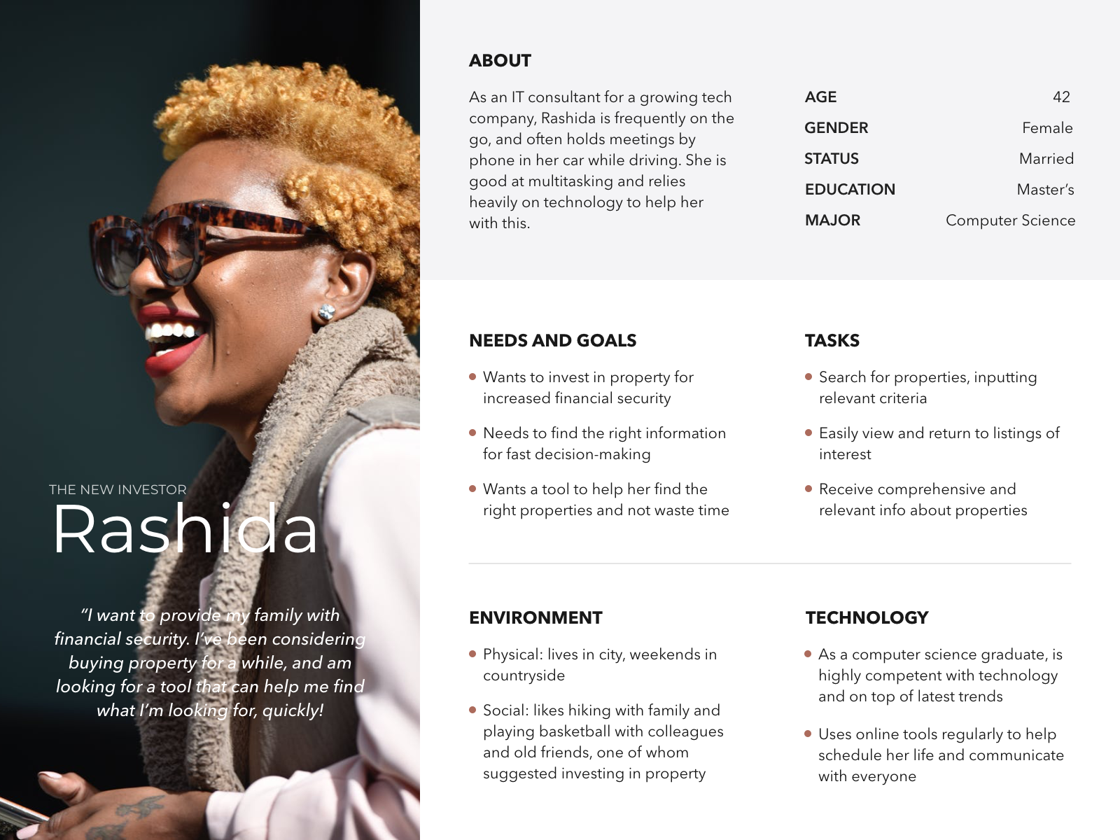
Understanding the User
The user stories and research were provided to me in the project brief. My job was to piece together all the user persona details into a visual representation to better empathize with Rashida, the new investor.
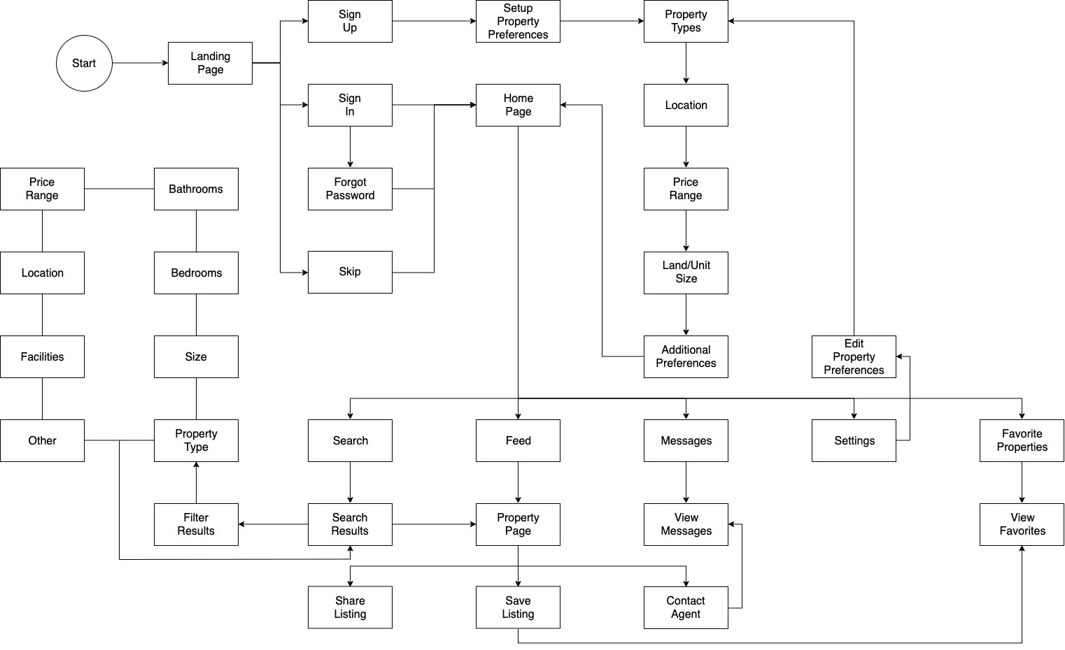
The project brief also provided the background context and mandatory features such as Sign In, Search with Filter, Property Listing Details, Contact, and Bookmark. Due to recent trends in personalization, I incorporated property search preferences as a feature upon registration so that the user would automatically have a list of available properties specific to their needs whenever visiting Perfect Properties.
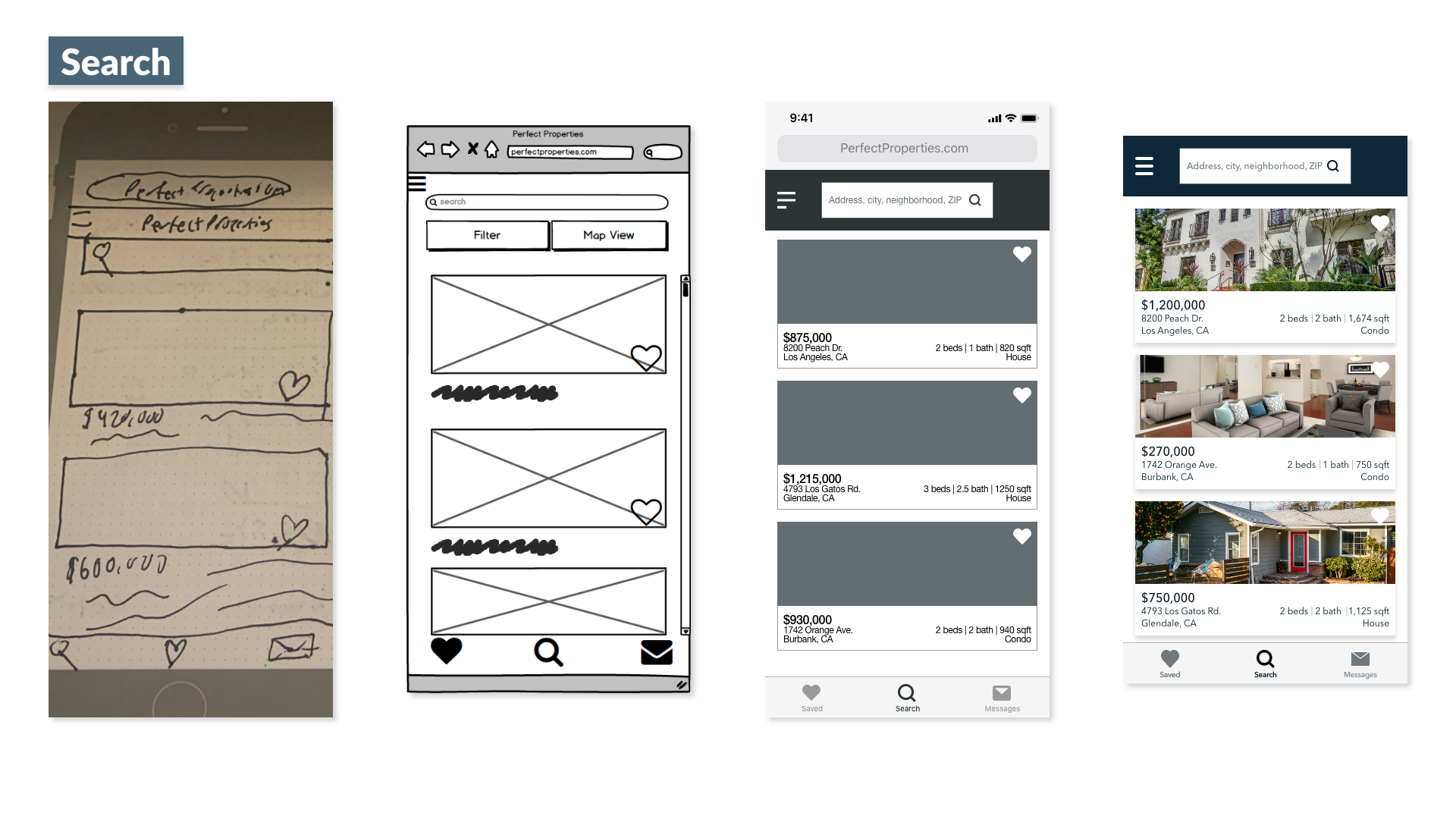
Wireframes
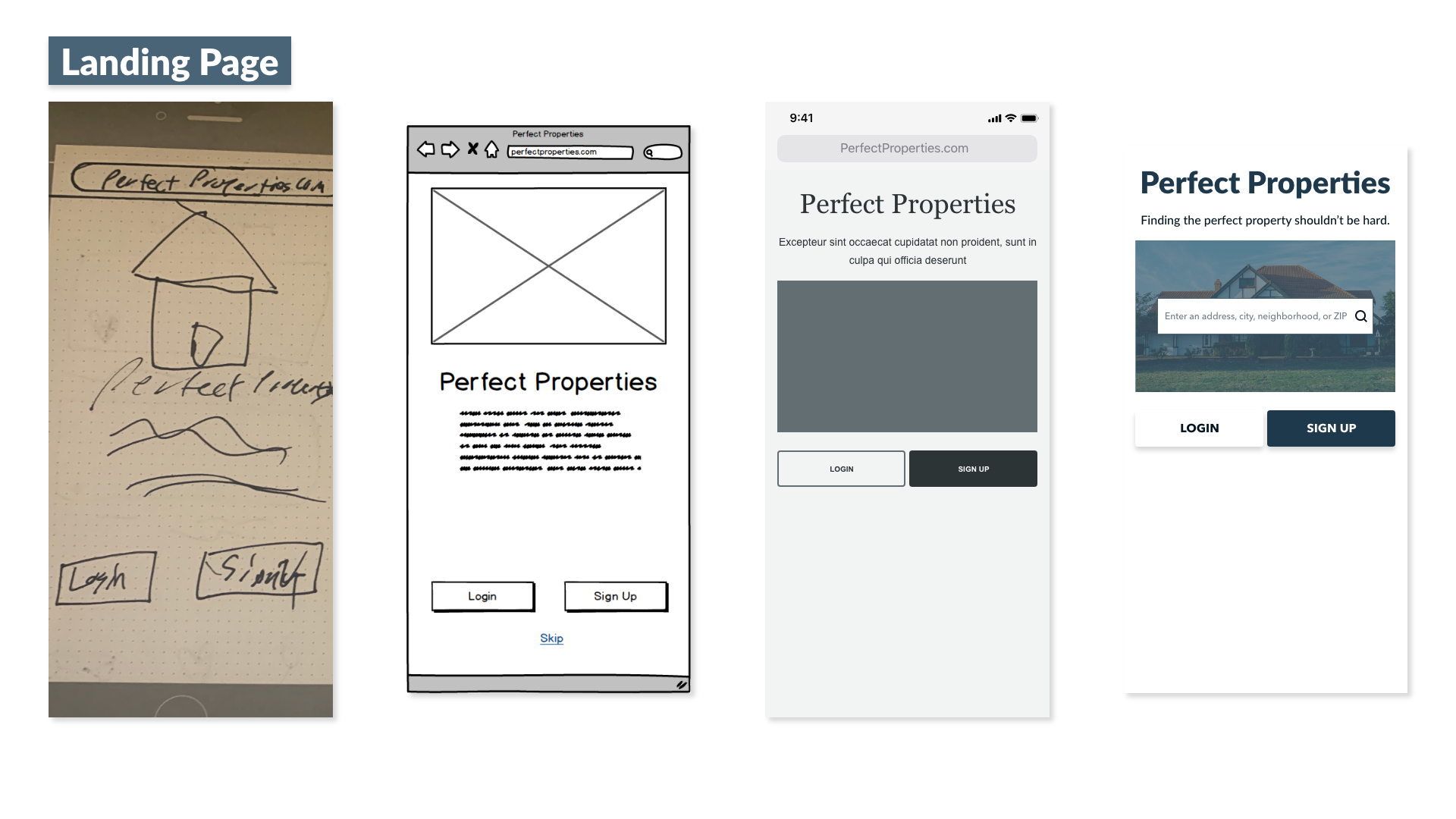
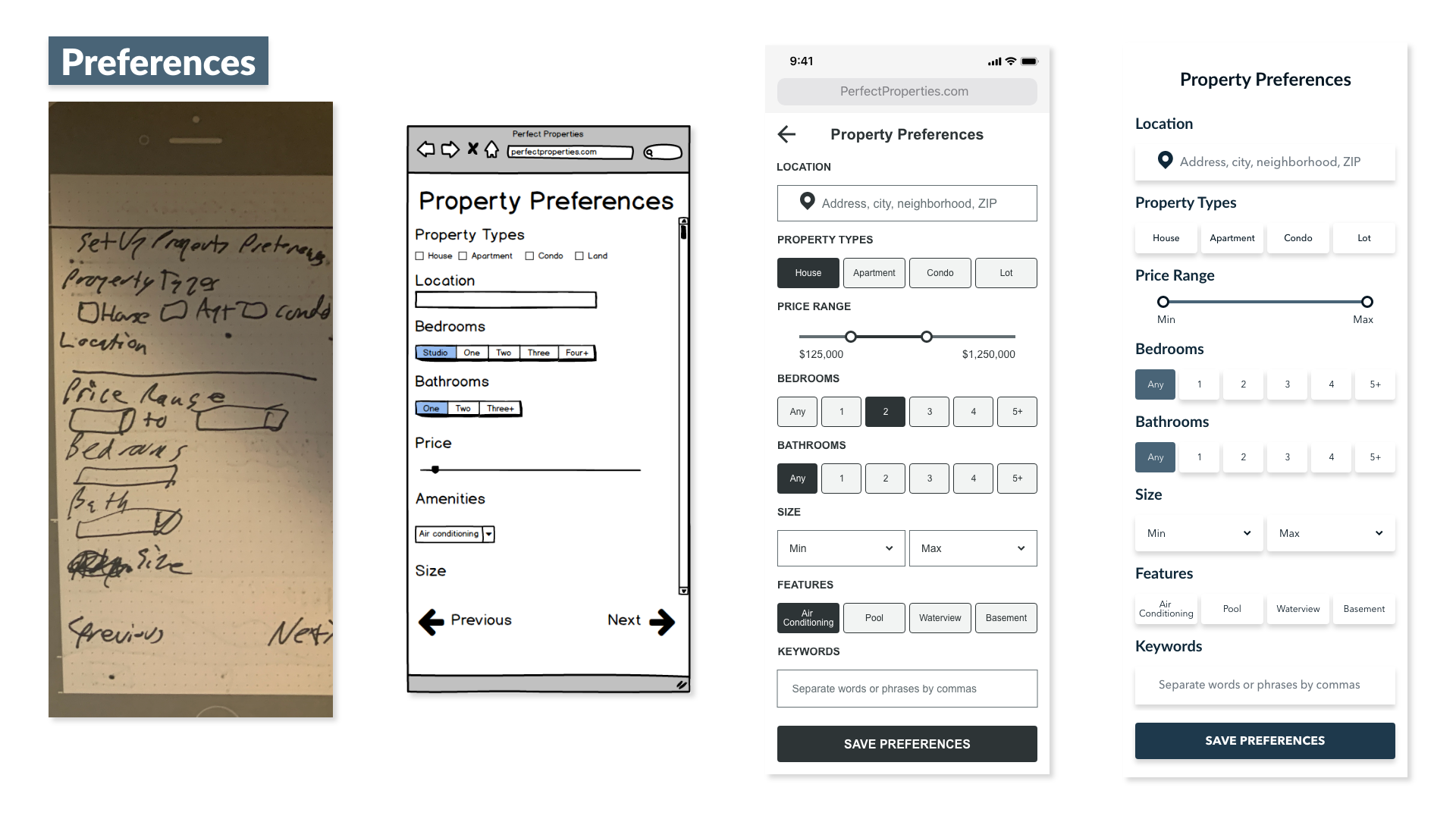
After a few rounds of rapid prototyping with quick sketches using pen and paper, I began to piece things together digitally using Balsamiq. Once satisfied with the general structure of my screens, I switched to Adobe XD for mid-fidelity wireframes, incorporating responsive layout and grids, UI elements, design patterns and visual hierarchy. After settling on imagery guidelines, a color palette and typography and building a set of icons, I applied them for high-fidelity wireframes.
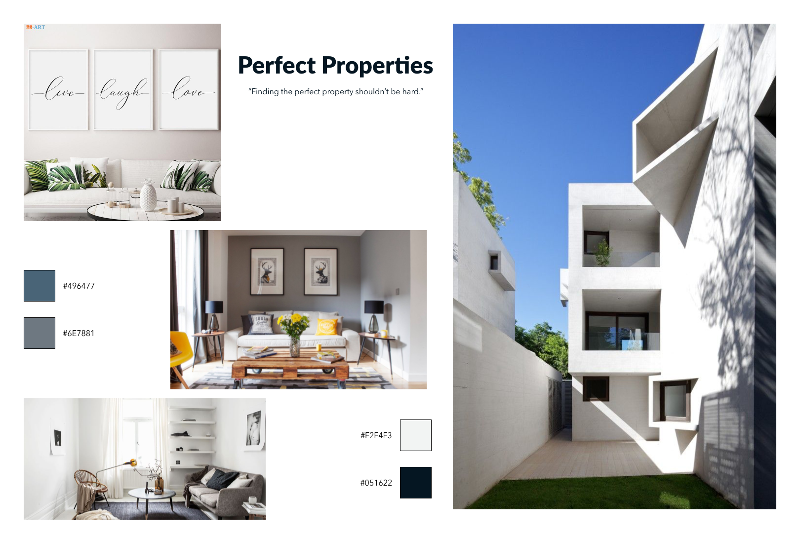
Mood Board
Because Perfect Properties is designed to streamline the process of finding property, its aesthetic should likewise reflect simplicity and ease. Taking the needs for a minimalist aesthetic into account, I designed a mood board for a simple, clean look.
The Lato and Avenir Next typefaces were chosen for their legibility, professionalism and availability for free. I chose a monochromatic palette of blues and grays to convey security and professionalism, while recalling the colors found in neighborhood investment property developments.
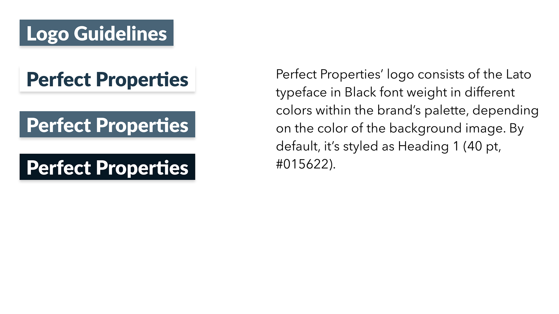
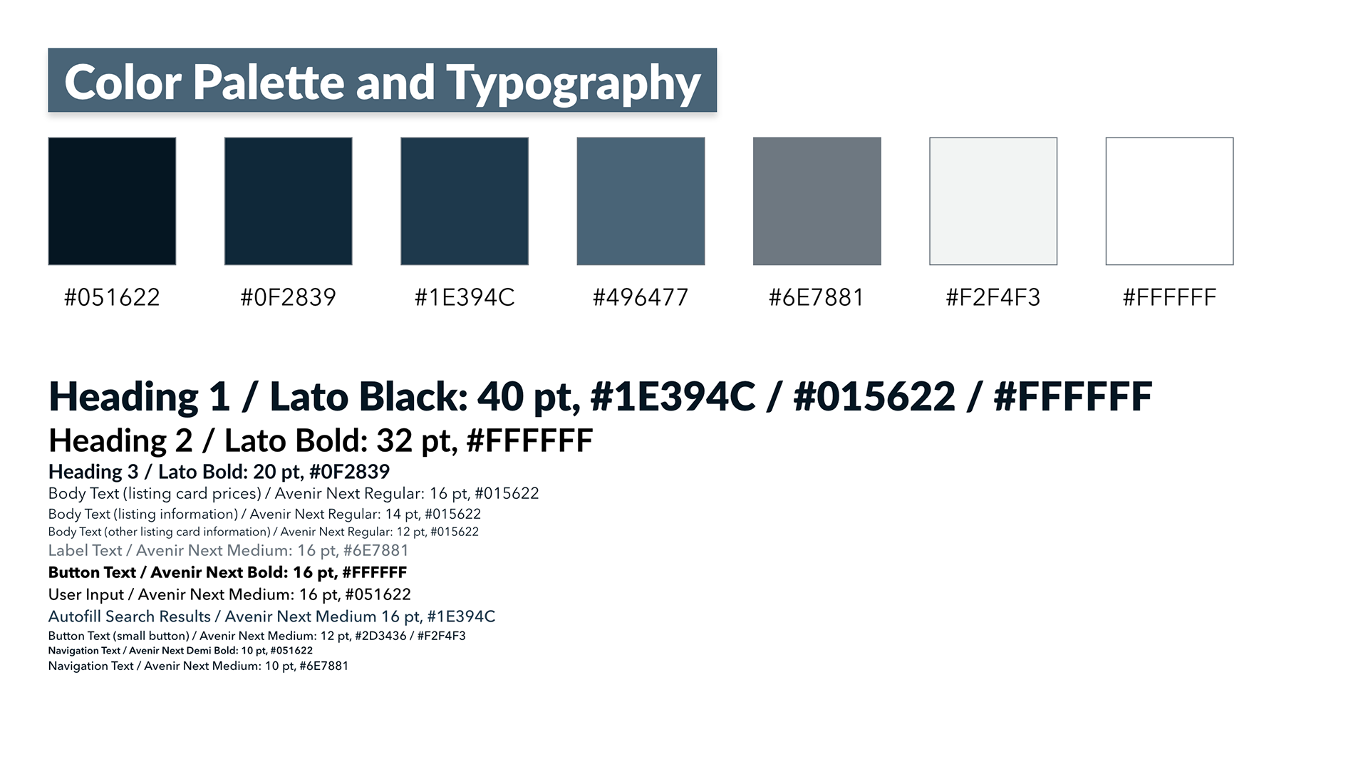
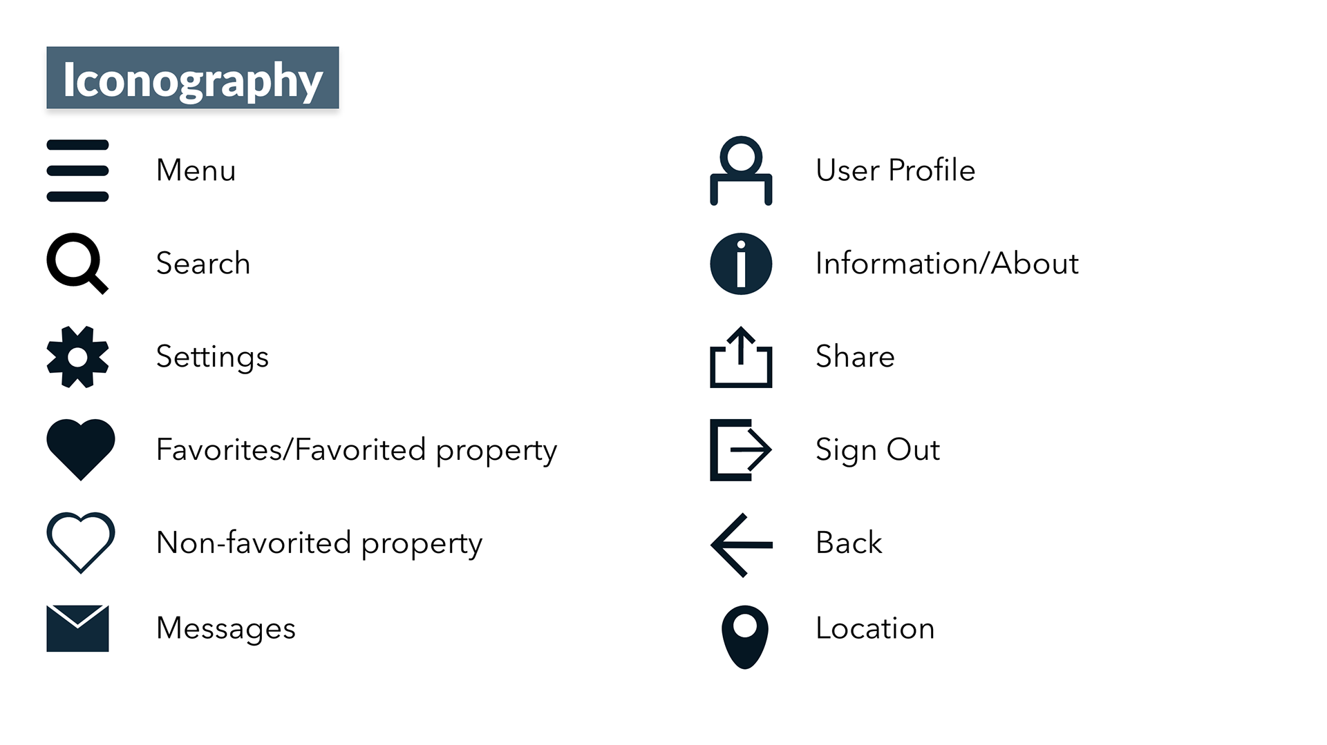
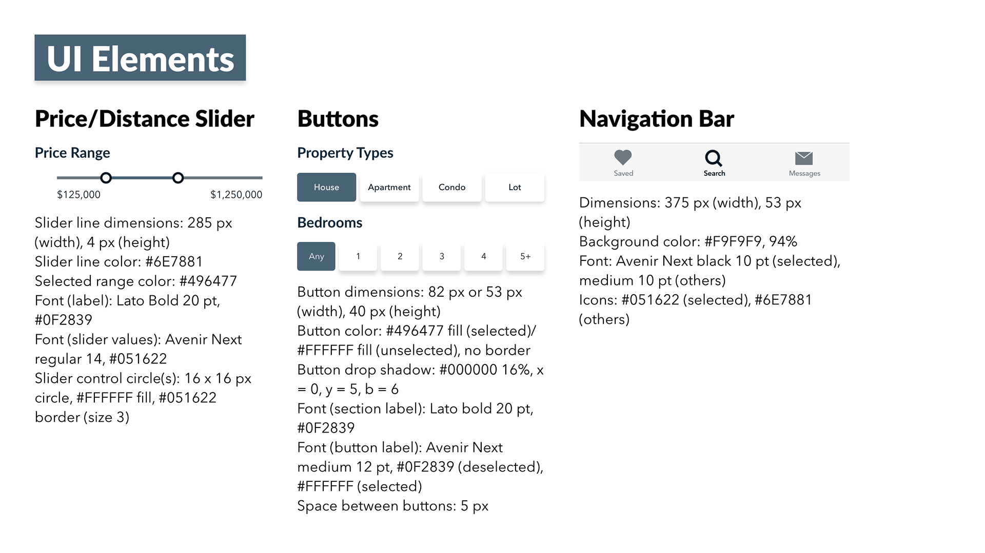
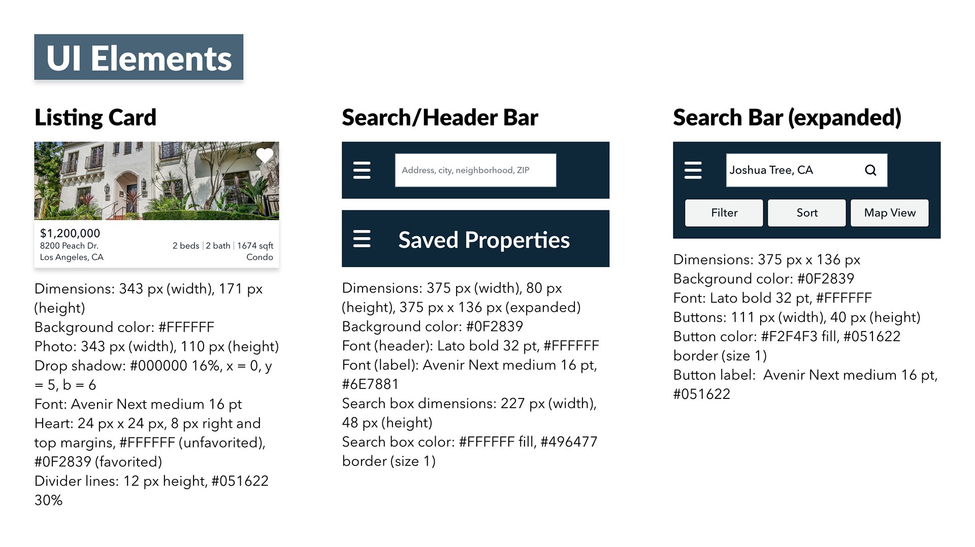
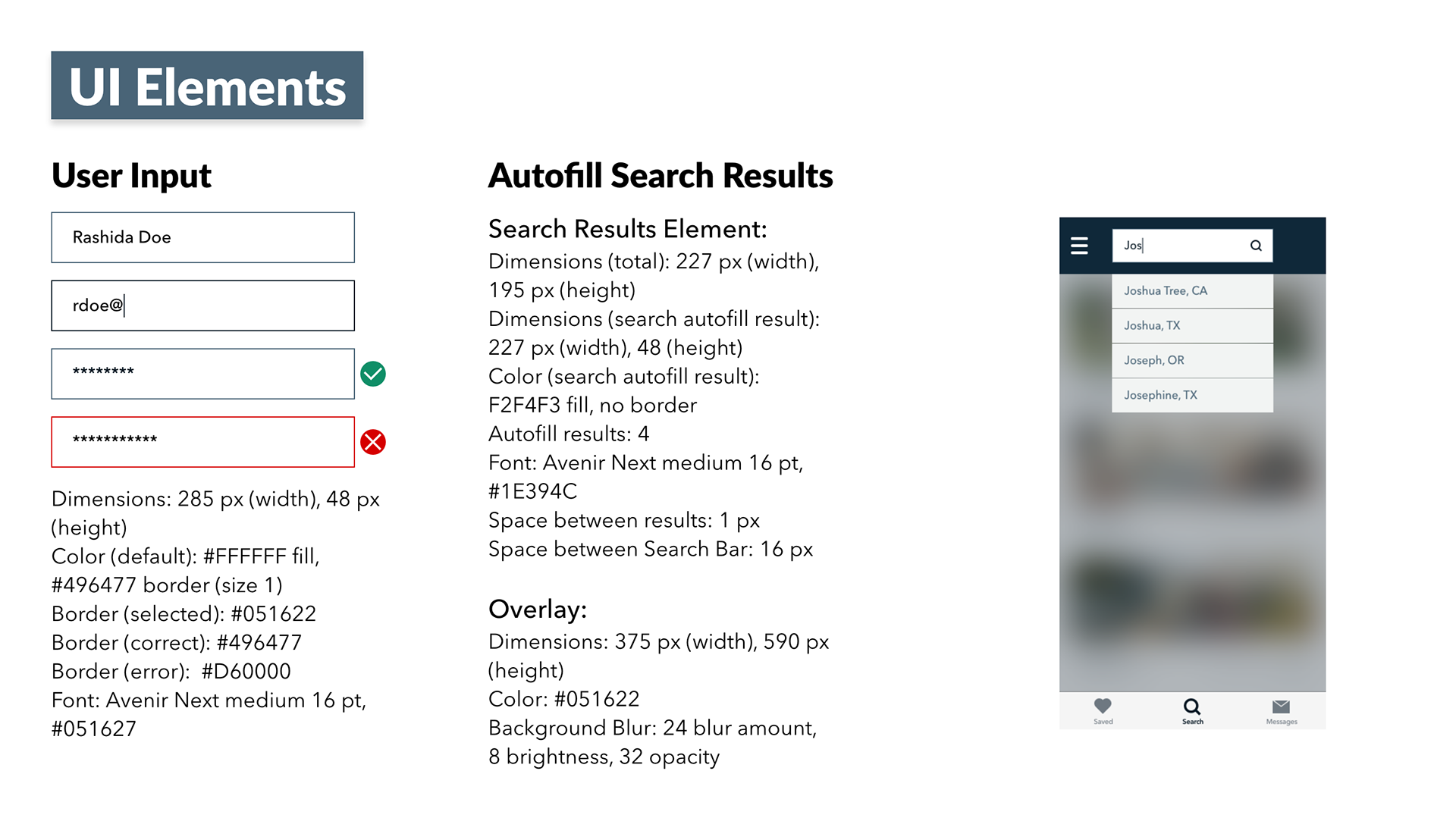
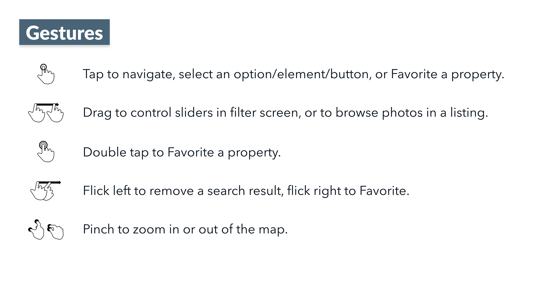
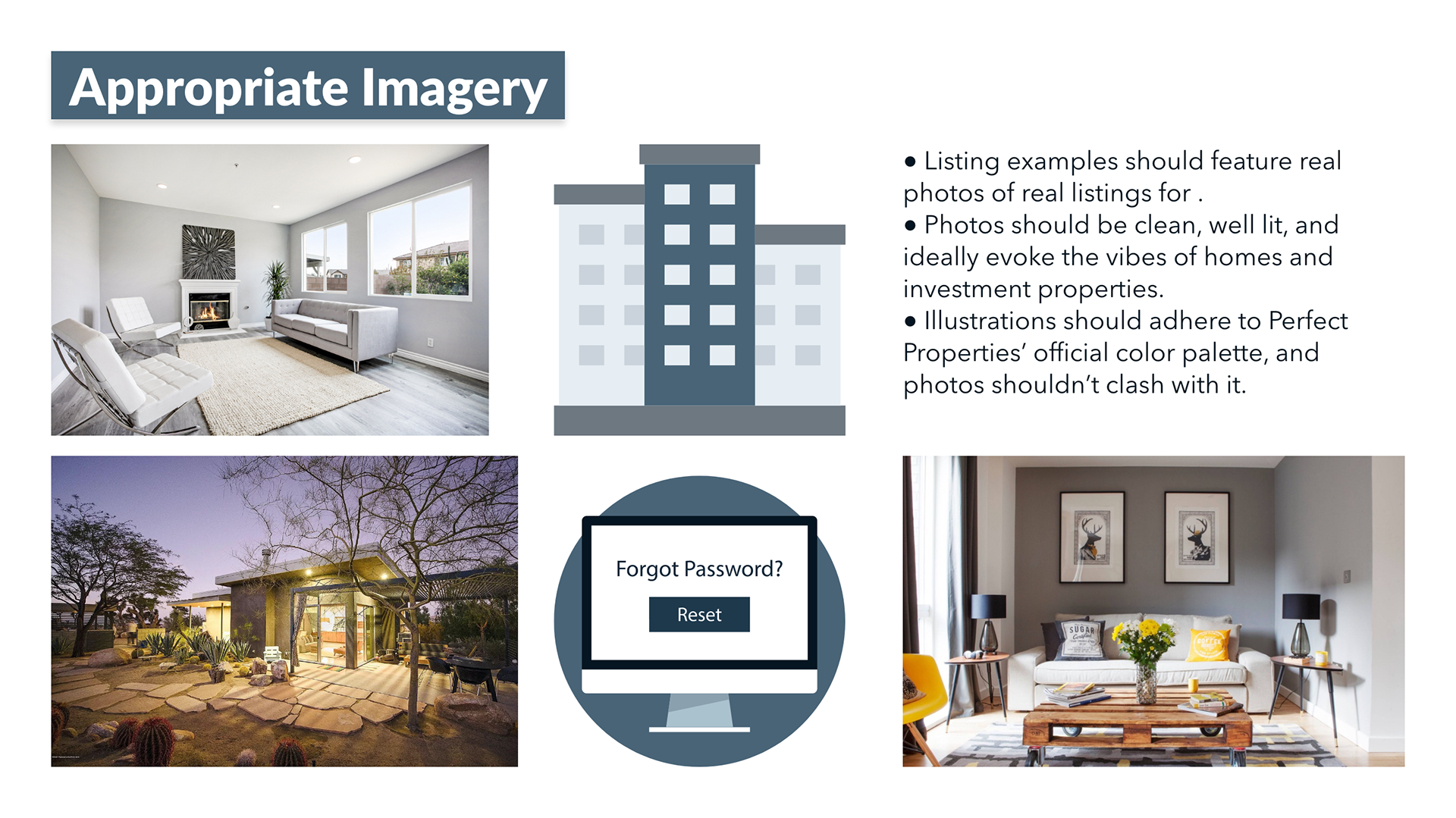
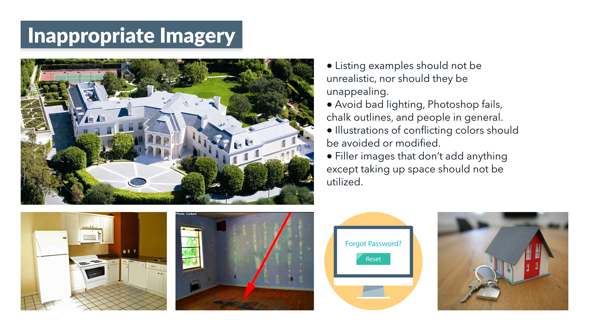
Style Guide
Mockups in Different Breakpoints
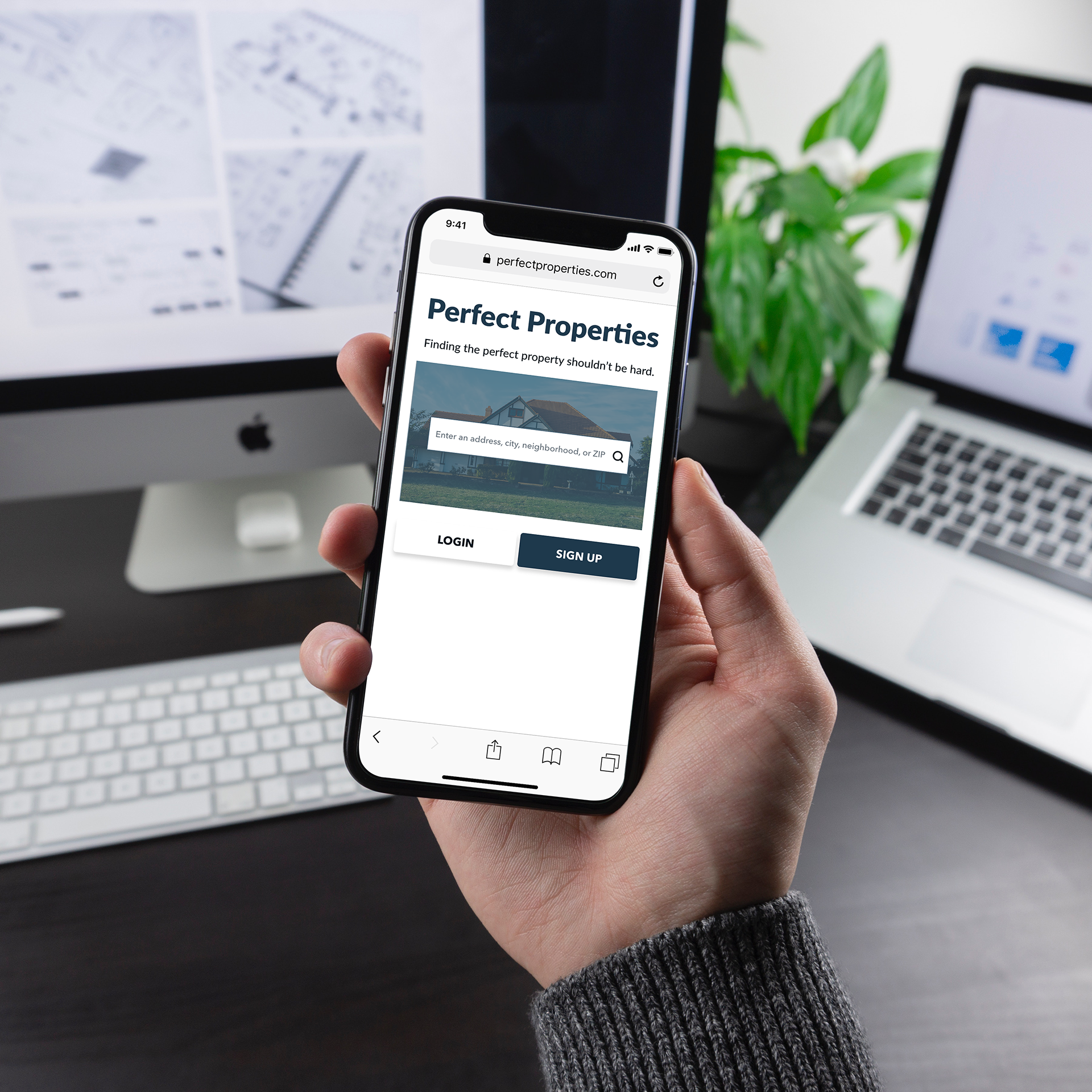
Final Clickable Prototype
Try out Perfect Properties: https://xd.adobe.com/view/c45e9598-b859-491f-754d-c58f39c47632-b26f/